Imagine walking into a ceremony space that takes your breath away. For a lot of people—including me, yes, guilty—the first thing that hits you isn’t the flower arrangements or even the lights. It’s the color. The vibe. That hue wraps you up, right in the feels. But what makes a wedding color “the most beautiful”? Is it blushing soft pinks, bold midnight blue, dreamy sage green, or even a moody black? Not everyone agrees, and that’s the fun part. It’s personal, cultural, and totally emotional. Right now, brides and grooms obsess over choosing that one special color that looks gorgeous but also whispers “us.”
Why Color Matters More Than You Think
Colors do way more than just decorate a wedding. They set the scene. Scientific studies show that color can change our mood and shape our memories. The right color palette can make a photo pop, highlight your dress, and ensure your grandma still raves about your tables five years later. According to research from the Pantone Color Institute, 90% of snap judgments about a space are based on color alone. That's huge if you're thinking about wedding photos hanging on your wall for the next decade.
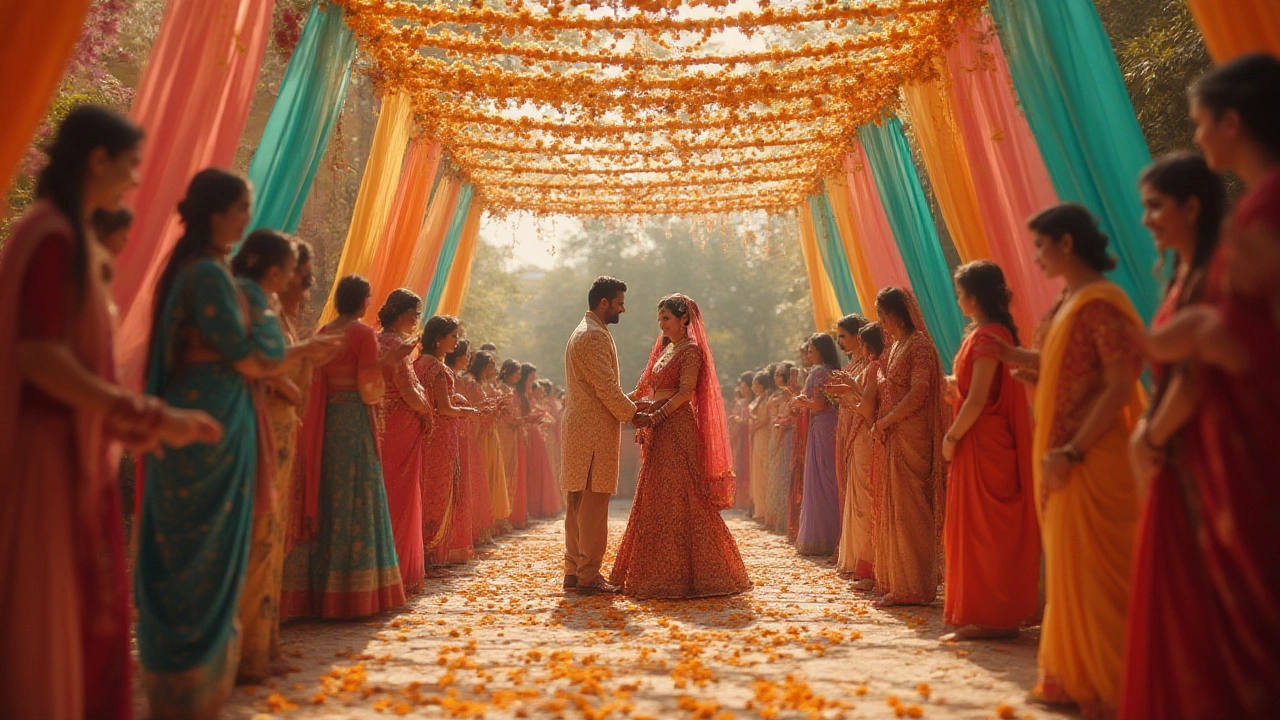
Cultural significance plays a starring role in color choices too. Want proof? In India, red shouts ‘wedding’ and stands for luck and love. In China, red is also prized, but white—so loved in Western weddings—is thought to bring bad luck. Modern Western couples are starting to look past blush and burgundy, with emerald greens and champagne gold coming up fast. In a 2024 Zola survey, 32% of couples chose green-based palettes—a major leap from just 15% in 2018. Earth tones like terracotta and olive are everywhere on Instagram now.
Why this rise in variety? It’s all about personalization. No bride or groom wants a copy-paste event. Color can tell your story—maybe you pick your college’s colors, or the dusty blue of the lake where you got engaged. It’s about making the day yours. Remember, people might forget the appetizers, but they always remember how your wedding “felt.” Guess what drives that? Color, hands down.
But don’t think your favorite shade looks good in every setting. Lighting, season, venue, even weather—these all change how a color looks. My friend once picked lilac for a spring wedding, but the grey skies made everything look washed out in the photos. At my sister’s late summer bash, rich, burnt orange looked perfect against the golden sunset. Think of your color as a chameleon—it changes, sometimes dramatically, with surroundings.
The Classics vs. the Trendsetters: Which Shades Win?
Do you stick with “tradition” or push things into Instagram-legend territory with bold, modern shades? Ivory, blush, white, and gold have ruled wedding color choices for decades. They represent elegance and timelessness. Even today, The Knot says 53% of 2025 brides pick white as one of their core colors. These shades look gorgeous on nearly everyone and are photogenic in almost every venue. White invites florists, planners, and mothers-in-law to nod their heads in approval. Safe? Sure. Cookie-cutter? Not if you play with texture, metallics, or secondary colors for flair.
But don’t sleep on emerging shades that go viral for a reason. Sage green is the current darling for a reason—it’s soft without being childish, mature without being stuffy, and works indoors or outside. Sage pops on social media because it matches greenery trends and looks sophisticated under most lighting. Mauve and dusty rose bring a moody, vintage feeling without getting loud. I went to a twilight wedding last fall with hunter green and navy—it looked killer with candlelight and set a really intimate vibe.
On the flip side, some wild card colors are making waves right now. Black accents (think velvet table linens or dark centerpieces) popped up in 27% more weddings last year, according to WeddingWire. They bring a level of mystery and sophistication couples are hunting for. Or, if you live for summer, coral and turquoise feel like a destination wedding, even in a city ballroom. There’s even a rise in “color-blocked” weddings, where guests wear one bold color like cobalt blue or fuchsia. If it sounds out-there, look at Pinterest—color pops make for show-stopper group photos.
Let’s not forget metallics. Gold is classic, but champagne and rose gold are softer, friendlier, and more modern. They don’t scream for attention, but they tie together brighter florals or jewel tones with a cohesive glow. The luxury effect is real: even a touch of metallic can make bargain decorations look high-end. If you’re nervous to commit, metallics work as accent ribbons, chargers, or even invite details, so you don’t overdo it.
Choosing the Right Wedding Color for You: Tips, Pitfalls, and True Stories
Picking the most beautiful wedding color isn’t about scrolling endless swatches. It’s about knowing what lights you up. That’s what I told my cousin last winter when she panicked over Pinterest boards. Here’s what helps make sense of the chaos:
- Start with your wedding vibe. Before picking colors, ask what feeling you want. Is it classic romance, boho chic, artsy, or moody? Color follows mood.
- Check your venue. Barn weddings look stunning in earth tones. City lofts kill it with stark whites and bold contrasts. A garden venue? Go pastel, sage, or blush to blend with the outdoors.
- Consider the season. Spring lends itself to lighter pastels. Summer is prime for bolder hues (coral, navy, bright greens). Fall means gold, rust, deep burgundy, hunter green. Winter? Think jewel tones or icy blues.
- Don’t ignore your personal favorites. There’s something about getting married surrounded by your “power color.” If you look best in cool tones—let that guide you. Don’t pick orange if it clashes with your whole bridal party’s skin tone. True fact: pictures last forever.
- Sample—don’t guess. Take a few fabric swatches or flowers into your space. Lighting can turn butter yellow into sickly green really fast. Hold your sample up at dawn, noon, and for evening lighting before you commit.
Let me tell you about a real mishap. My friend Riley picked hot pink based solely on how good it looked on Insta. In her venue, with yellow-hued chandeliers, it turned shockingly neon—think nightclub, not wedding. Her florist jumped in, swapped half the flowers with softer pinks and gold foliage, and it saved the day. That’s why always pair brights with neutrals for balance.
Want to see real data on what colors shine in wedding settings versus what just looks “meh”? Check out the table below, based on results from a 2025 survey of over 2,000 couples and photographers:
| Color | Popularity (%) | Rated "Most Photogenic" (%) | Longevity (Resists Trends) |
|---|---|---|---|
| White | 53 | 92 | High |
| Sage Green | 32 | 89 | Medium |
| Navy Blue | 28 | 85 | High |
| Gold | 22 | 86 | High |
| Blush Pink | 19 | 82 | Medium |
| Burnt Orange | 12 | 70 | Medium |
| Black Accents | 10 | 55 | Growing |
| Mauve | 9 | 62 | Medium |
Notice how some colors never fade (white, navy, gold), while others fluctuate with yearly trends. Trust your gut but ask your photographer, too—they know what pops on camera and what’s tough to edit.
And please, don’t let outside voices—yes, even your favorite aunt—pressure you into colors you don’t love. The most beautiful wedding color is the one you can’t imagine your day without.
Pairings That Wow: Combining Hues for a Cohesive Wedding Look
The real secret sauce isn’t just the main shade but how you pair it. Mixing colors is like writing a playlist—too much of one note is flat, but the right combo? Pure magic. Here’s what’s winning hearts and likes right now:
- Sage green with white and soft blush (earthy and soft; perfect for spring/summer garden weddings)
- Navy blue, gold, and ivory (classic/formal; gorgeous for night or ballroom)
- Burgundy and dusty rose with touches of eucalyptus (elegant/moody; killer for autumn, very photogenic)
- Terracotta, peach, and emerald green (boho/modern; works for indoor and outdoor settings)
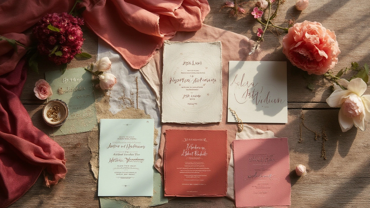
- Champagne, mauve, and dove grey (subtle, romantic, super trendy on social right now)
If you’re nervous to go bold, weave in neutrals. A strong color with pale tones looks balanced and more upscale. Don’t forget about texture—velvet table runners, silk ribbons, matte ceramics. Texture brings life to colors, especially in photos.
The number one mistake—according to my planner friend who’s seen it all? “Too much matching!” If you’ve got sage dresses, sage linens, sage invites, it comes off flat and bland. Colors should talk to each other, not shout over each other. Use a base color, then layer with accents for depth. That’s how weddings in magazines pull off “effortless beauty.”
And just for fun, here’s a tip from my daughter Bryony, who’s very passionate about colors (she says pink rules everything!): Test shades in natural light before you go wild with invitations and decor. Even Whiskers, my lazy tabby cat, loves to sprawl on the sunniest color sample in our kitchen—definitely a critic, if you ask me.
At the end of the day, the most beautiful wedding color is the one that feels like you. Your color, your mood, your memories. Whether you go white and gold, sage and blush, or even jazz it up with midnight blue or burnt orange, let it outshine everything. The best color leaves everyone with a smile—and a wedding Instagram feed worth reliving for years.
Releted Post

Mara Eldridge
I am a wedding services coordinator with a passion for helping couples create memorable celebrations. My expertise lies in sourcing the best venues, vendors, and accessories to bring each couple's vision to life. I enjoy sharing insights and tips on wedding-related topics, aiming to inspire those who are planning their big day. My writing combines practical advice with creative ideas to suit all styles and budgets.
Comments
Post Comment